#same font that gets used on the series 2 trading cards
Explore tagged Tumblr posts
Text

Font name: Improv ICG
Origin: Against the Grain Gourmet® pizza
Medium: food packaging
4 notes
·
View notes
Text
4Kids Korner - Season 2 - Episode 3
I'm a bit late this week because I got caught up with work and school-related dread, but now I'm back to bring you more 4Kids products! This week we have an epic trifepic: Winx Club Magazine Issue one - the castle, Kirby Right Back at Ya - Ice Kirby (DVDouble-Shot) and Kirby Right Back at Ya - Kirby Comes to Cappy Town!
Let's start by getting the smallest one out of the way. Here's Kirby Right Back at Ya - Ice Kirby (2005)


There's something I oddly like about DVDouble-Shot. Starting In 2005, the DVDouble-Shot line was introduced featuring two-Episode DVDs of 4Kids most profitable shows as a way of promoting 4Kids TV. As for the consumer, the main selling point is that you could buy them for a low price, collect and possibly trade them with your friends, kind of like Pokémon cards. I like the idea of one kid saying to the other on the playground, "hey, wanna trade your Ninja Turtles for my YuGiOh?" How successful they were, I have no idea, but they're fun and easy to review on this show. Given their small portion size, practically every DVDouble-Shot is the same. This one had the episodes "The Chill Factor" and "DeDeDe's Snow Job," in accordance with the ice theme of the disc. It also features assorted promos for then-current and upcoming 4Kids shows identical to those seen in the 4Kids TV September demo disc (which I will hopefully review some time in the future.) Before we move on, though there's one little thing I want to point out about the box art. You can't see it in the photos I've provided, but the ice monster on the cover is far more pixelated than Kirby, if you look closely at it, so it appears to me that they lifted it right out of the episode and placed it on the cover. I guess that's just what happens when no official art of a character exists for your graphic designers to use...
Now that we have that one out of the way, let's talk about the stars of today's episode, which actually turned out to have much more historical value than most of the other stuff in my collection. So say hello to the Winx Club Magazine Premiere Issue, The Castle (2005)

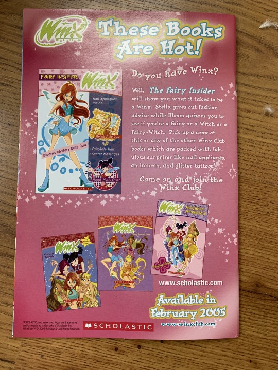

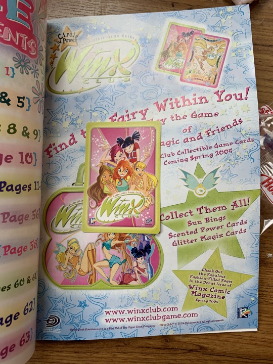
This is a very special addition to my collection not only because it's part of what I consider to be 4Kids' absolute peak year, but since the book was presumably printed in January of 2005, it means this was one of the first pieces of of merchandise to feature the now-famous 4Kids TV logo. Heck it might have even been printed before then. As for the book itself, it's quite cute as it features everything an 8-11 year old girl wanting to be a hip and trendy 2000s teenager could want, and contains surprisingly few ads for Winx Club merch. And even more adorable, is the publisher's attempts to fit that description using words like "slammin'" in sentences. I call it a magazine, but it's really more dedicated to the comic included, "The Castle," which I would have read, but I needed to get some sleep the day I read it, so I skimmed the book's numerous activities, instead. But for those still interested, the comic is a retelling of Bloom's enrollment in Alfea, with original art that's pretty accurate to the actual show. But the book's real allure is the activities. Like the free trading card you'll see in the photo above. It even comes with a full-page description of what a trading card game is, making reference to YuGiOh in the process, which I thought was funny since 4Kids owned that, and also because it heavily implies that only boys play YuGiOh when the show itself has many female duelists. After that, you have a faux interview with Bloom taken from the perspective of a fellow Alfea Student. What I remember most clearly about that, is that Bloom says she listens to top 40's, which made me think "man, she's got some trash music taste," even though I, myself have said on multiple occasions off of tumblr that I listen to basically everything. Also included on the magazine are a paper fortune-telling toy, a best friend diary which includes a "secret crush" slot to fill in, a page for writing down predictions about the reader's future, and even a personality test which assigns your traits to a type of flower, as suggested by Flora on the page. The funny thing about this is that one question asks for the reader's favorite kind of movie, and one of the options is "anime everything," which I thought was funny since anime was just starting to get big at that time in America, and the online anime community was just starting to grow. Finally, on the last page, probably the most creative of all, is a step-by-step slumber party plan by Musa, which details inviting everyone over, having them show up dressed as their favorite popstar (like Brittany Spears, for example) and bring their favorite CD from said popstar, then taking turns playing them and talking about them. It sounds quite fun, and it made me smile imagining all the little kids who tried this. That's exactly what I think is awesome about children's entertainment: it makes them happy and builds their imagination. So that's the Winx Club Magazine, a really good buy, but I must admit they used the same art of the girls more than once on a few occasions, and also wrote in a plot hole in the interview with Bloom, where she says she discovered her powers as a child, but in the show she unlocks them at her current age when saving Stella from the first monsters of the series. So it may have a couple flukes, but still quite enjoyable.
And last, but never least, it's time for Kirby Right Back at Ya: Kirby Comes to Dream Land (2002)
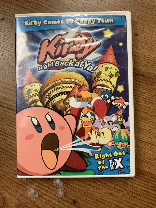

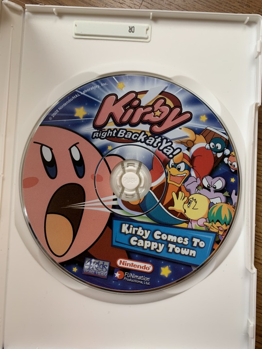
This one is also historically significant for two reasons. One is that it was the very first release of one of the more famous non-Pokémon/YuGiOh shows 4Kids had to offer, but it also played a part in promoting the very launch of the Fox Box, as you'll see on the box art. This disc may only have the first three episodes of the show, but it super makes up for it with a plethora of special features, more than any of the DVDs I currently own, and that they strangely enough don't tell you about on the box. And speaking of the box, though you might not see it, the episode descriptions on the back are written entirely in comic sans. Yeah, it's clear to see 4Kids wasn't quite as sharp as they would be in the next few years... and the DVD menus are also written entirely in this font. But that doesn't take away from the outstanding value. much like the Fright to the Finish DVD, this one's special features are split between two menus. For this one, there's "More Kirby" and "Added Attractions," which is the far superior one, but more on that in a minute. The More Kirby menu features a character gallary telling you about the main cast, set to music from the show. Then there's "Kirbyoke," which is there to teach the kids the words to the theme song. And finally, we have a preview for the next DVD in the series, which at that point hadn't a proper name, so Mike Pollock's voice just refers to it as "Kirby Right Back at Ya Volume 2." Then, in the "Added Attractions" menu, we have a promo for Cubix - Robots for Everyone's first DVD release, a short promo for the newly-launched FoxBox.TV website, and the star of this review by far, "What's Inside The Fox Box?!" This incredible 14 minute long promo (which you can find on Youtube, by the way,) previews every single show in the Fox Box's initial lineup as a way of hyping up the network for it's September 2002 launch. Well, kind of... You see, 4Kids made multi-minute promos for their own productions, complete with plot synopses by Mike Pollock and others and theme songs for the shows. Meanwhile, Stargate Infinity, a third-party show, only got a promo featuring still images of the main cast, a paper-thin explanation of the plot and no opening, all clocking in at under a minute. So, yeah, pretty lame move on 4Kids part, but at least we get to see HD footage of 4Kids lost Ultraman Tiga dub. Ultimately, it's a really fun promo from 4Kids' very beginnings as a dedicated children's entertainment company, even though it uses some uncut clips of guns in Fighting Foodons since the dub wasn't finished at that point. One last thing to point out: the promo for Teenage Mutant Ninja Turtles (which hadn't even started production at the time,) features an unused theme song demo for the series which also made it's way onto the illusive Fox Box CD. So there you have it, one of the DVDs that started it all. Thanks for reading about it, as well as my other items this week. I will be back with more next week, so hang in there, and I'll see you all next time. Take care!
#4Kids#4Kids TV#4Kids Anime#4Kids Dub#4Kids Entertainment#Kirby#Kirby Right Back at Ya#Kirby of the Stars#Winx Club#Books#Fox Box#DVDs#Cartoons
11 notes
·
View notes
Text
New grydscaen Hacker Logo Designs

New Year New grydscaen - Cyberpunk Reboot 2021
Today I started desgning new logos for the cyberpunk "grydscaen" series to kickoff the new round of hacker character designs WIP for the "grydscaen: hack the mainframe" RPG trading card game promos and kickoff of my new newsletter and the release of the new release of the special edition "grydscaen: the seal maker 2nd edition with a cool new cover featuring bio hacker Hiro Yamaguchi the Velveet Hour terrorist who bombs the subway. The first logo design featured in this post is the mascot avatar for the illusive DNA data pirate anti-government rebel hacktivist group, the Black Holes lead who claim militiant strategist and mastermind Gryphon as their leader.
The idea behind the new designs was the re-release of four grydscaen books specifically grydscaen: war book 2 when the Atlantea Federation attach the Pacific Territories in the City, grydscaen: alliance book 3 when Packrat Saicho and leader Faid Callen is wounded starting an internal Packrat civil war, and grydscaen: insurrection boook 4 where the Psi Faction team is deployment direct to the Atlantea Federation homeland of Londes on mission with the Esset battlefleet aboard the Battleship Escalon.
These re-relases are accompanied by the new WIP release currently in galley edits grydscaen: idol whihc focuses on one of the main musicians that pops up in the grydscaean story, the glam rock band, Athens with lead singer Hibiki Sato and drummer Takira Mizutani as they train to become rock stars at IHS Music Academy inn the Echelons. Plus was have the second edition re-release with a fully re-written storyline of the flagship grydscaen title, the first book published in the dystopian cyberpunk series grydsacen: retribution which Kirkus Reviews called "anime-esque and well written" and Rainbow Gold Reviews called "dark adn gritty, an unpolished gem... as dark as it gets" for a new decade renamed to grydscaen: revolution featuring the Packrat leader Faid Callen startng a hacker revolution and all new cover art featuring the same character on the original cover which was drawn while I was studying animation inn art school the clandestine psychic operative and damper Julian "Blue" Iskafiin.
The Black Holes Logo Concept
I wanted to kickoff the new logo designs with bold hard black-and-white lines with hard angle fonts, gritty graphitti-like urban warfare logo gamer graphics and a bold statement. I started with the hacker group the Black Hole because they are the most militant of the rebel anti-government hacker gangs in the grydscaen series.
The character gryphon is central to the climax of the book grydscaen: dark after Jester wipes the Triumvirate leader Zoon's memory. Though we see him in other books, this is the first time we actually get a close iinsight into his personality. That messed-up narcissistic militant view of a harsh world full of goernment corruption and lies shapes gryphons view and drives him. I wanted to have the Black Holes logo be sort of subversive and edgy so went with a sneering mask feel. The blue highlight colour I chose to resemble to blue sky before the nuclear bomb which is now shrouded in a reddist lightening toxic colour left over from the uceal explosion caused by the Dionysis Effect which forev rendered the sky red lightening covered innn radioactive fallout. The blue is a hint at Grypon's soft spot hidden deep within his militant harsh exterior.
The grydscaen Hacker Factions
There are many hacker factions in the grydscaen series. Each group has a particular purpose. They include:
- The Black Holes - DNA Data Pirates led by Gryphon
- The Packrats - Anti-government Psychic Cyberterrorists led by Faid Callen
- Velvet Hour - Climate Terrorist Bio Hackers led by Rafe
- The Terror Hack - Anti-Government Rebel Hactivists led by Mage
- Jester Hacker Guild (JHG) - Anti-Corporate Blackhat Hackers led by Jester
- Clannet - Organized Crime Drug Gang Directed by Drug Dealer Wraith
- The Soul Deep - Jet Jockey Underground led by Hacker Informant Jazz
The Packrats Clan is then further broken down into sub-groups called "inner factions" which are only recognized internally and include:
Runners led by Ang responsible for runs and psi inducer drugs. Mobile Comand Center led by Dark responsible for the Mobile Frames. Wastes led by Set later Naito Sennish, the main Packrats fighters . Acolytes run by Elite Level 9 hacker Acoyle formerly of Terror Hack. Prophets led by Aseth who act as spiritual gides for the Packrat clan. Hosts whose members are hosts and escorts. The rules for these groups are all layed out in the Packrat Code which is included in the series bible, a sort of fandom encylopedia of characters, locations, drugs, political factions, warring governments, global powers, rebel hacker groups and terminology used in the grydscaen seriesand included in the appendix of the backstory book grydscaen: beginnings.
Hacker Logo Design Plans
All logos will be black and white with a single highlight colour for each group with the Black Holes colour as neon blue. The designs will be timed to the re-release of grydscaen: revolution and hoping to have them all completed by the indie release of the tech noir series sequel to grydscaen: dark and grydscaen: scout with the new novelette called grydscaen: zero day.
My Next Logo Design
Next design will be the bio hacker terrorist group Velvet Hour and the new 18 year old host Nier Ishida the petulant and flamboyantly gay younger brother to Sakama Ishida the Psi Faction Night Team Lead and psychic operative. Sakama can use the technique "witch blood" spiritual which is a psychicinduced medium power of the Prophets first highlighted in book 10, the final book in the main grydscaen series titled grydscaen: imperium.
#grydscan#hackers#hackersunite#cyberpunk#psychics#cyberpunkaesthetic#grydscaenseries#grydscaenmanga#grydscaenanime
0 notes
Video
youtube
Case Study
Don’t Hug Me I’m Scared // Web Series // March 2015 // Episode 4
DHMIS is a British animated surreal horror comedy web series created by filmmakers Becky Sloan and Joseph Pelling that first appeared online in 2011. The goal of the series is to comment on children’s television and learning, particularly in Britain. The intended audience of the series is teens and young adults of middle-class but, can be misinterpreted for young children at first glance. When the narrative of the series begins, it is clear that there is a deeper and darker message behind everything and thus, not suitable for younger audiences to watch. According to The Film Theorists, the context of the work is, “ultimately a parable for the loss of control that artists trade off when they work on bigger screens”. Their messages are manipulated and their morals are poisoned by others with ulterior motives. Thus, it addresses the negative influence of media on youth in terms of kid shows and manipulation. Each episode is only several minutes long that uses puppets as actors. For this case study, I will be focusing on Episode #4 entitled, Afternoon of the series as it is most relevant to my topic, directly dealing with the internet and technology. Each episode however, forms into one piece as the entire narrative takes place on the same day, but at different times of the day.
Analysis of Events
1. Question Fun
The episode begins with three puppets, Red Guy, Yellow Guy, and Duck, representing cast members from an ‘educational’ show for children. They are shown playing a board game called ‘Question Fun’ and the Red Guy chooses a card that asks, “What is the biggest thing in the world?” Looking at the details around the room, the viewer can see a calendar hanging on the wall with June 19th as the date, various wall decorations usually depicting an animal, and skill-based activities such as a bookshelf, a globe, and a math timetable poster. In addition, in terms of colour, the image of the room is very dull, boring, and uses mainly primary hues. Moreover, this scene questions the concept of ‘fun’ which is something that is never thought about in my experience. As Red Guy reads the question, he and his friends are unsure of the answer thinking, “if only there was a way to learn more about the world” thus, they turn their attention towards the globe for help. The globe spins around as a personified item with a face that is about to educate the puppets about the world, however a computer suddenly appears into the scene from behind and disrupts their attention from the globe. This expresses the notion that technology distracts users from finding answers with the resources that are available around them, for as mentioned before, the room is filled with other means of access to knowledge.
2. Digital Mind
The computer starts to sing a song that goes along the lines of, “im a computer…I would like to show you inside my digital life, inside my mind there is a digital mind”. I believe it expresses the notion that the user behind the computer is the mind inside the computer as people can be seen as functioning with the mind of a computer, hence being absent from the physical world with digital thinking space. The Red Guy asks the computer his question, thus choosing digital information rather than to look at the globe. However, his question gets interrupted as the computer sings about how wonderful he is for, “im very clever…I tell you the time, help you find something your wanting to find…you can do it all digitally”. During the song, the items that are mentioned are shown in a pixelated/bit-map style. The style used to portray the images relates to the concept of the online interface design. Also, a newspaper is shown on the table entitled ‘OPINOIN’ which is misspelled and the computer holds a magnifying glass over the news that is replaced with an image of oats. This expresses how useful information is replaced with ideas that are meaningless and pointless. Furthermore, as the computer continues to sing, the viewer can hear that auto tune is involved, expressing how people rely on these technologies for everything. I should also mention that the computer has hands that are usually mouse cursors. Furthermore, the word ‘Digitally’ is emphasized from the song as the word itself appears across the screen through a glitching process in a pixelated font. As the song wraps up, the Red Guy points out the fact that they already have a computer, showing a laptop placed near the globe slowly opening. This valuable piece of information had been cropped out of the scenes until this very moment. It expresses that even though the puppets were aware they had a computer, they did not seek it first for information.
3. Information
The computer mentions that, “before we begin our journey, I just need to get some information from you. What’s your name? Where do you live? What do you like to eat?” At this time, it shows the personal questions being printed out from the computer, with the icons and type on the paper in a pixelated style. The puppets immediately answer the computer with their personal information without taking the moment to think about what is being asked of them. This expresses the notion how users are willing to give up their information, especially when signing up for a new website or when starting up a new computer. The computer continues to ask a few other questions, but the Red Guy slowly begins to feel overwhelmed and irritated that he hits the keyboard and tells the computer to essential be quiet. The computer becomes incredibly angered by this and everything in the physical space begins to glitch. The puppets are suddenly transported into the digital world.
4. Digital World
The puppets transform from something tactile into a digitized representation of the self. The computer leads the puppets in an orderly line on a checkered path singing, “Welcome to my digital home! Everything made out of numbers and code!” The computer is suddenly seen with wires as legs, towering over the puppets in relation to height, depicting the notion of control over its users. Throughout the transition, a series of glitched and 3D graphics are shown of items that are floating around with large, googly eyes, looking directly at the puppets as they walk. The Digital world appears to be over-saturated, interesting and engaging unlike the ‘real’ world. The Yellow Guy is confused with what is happening as he questions, “If im sitting at home, but im inside the screen?” The computer answers, “but your not you, you’re your digital you, virtually real whose controlled by real you”. However, the puppets are not using any tools, such as a mouse, to control their virtual selves, so who is really controlling them? The Red Guy begins to show interest in this new world and asks, “in this digital world, what can we do?” The computer offers that, “there are over 3 things to do” showing only a bar graph that symbolizes information, digital style that symbolizes the need to keep up with the trends, and digital dancing that symbolizes entertainment. These words are replayed over and over and each puppet that opened their own door finds something new. The sequence gradually gets faster and the music also speeds up in the background. Everything at this point becomes dark and creepy as the Yellow Guy opens a door to no information, while the Duck’s design style becomes more realistic, and the Red Guy sees more people joining in on the dance. This moment shows how users are distracted by other things that the internet has to offer, such as fashion or entertainment that appear to look more realistic, resulting to the user not finding useful information in the end.
5. Physical World
The scene is shown back in the ‘real world’, however the Red Guy is sitting alone in front of the computer screen attempting to pull himself away and shut off the system. The two other puppets seem to have ceased to exist in the real world physically and are thus, portrayed as creepy pixelated holograms. This expresses the notion that the digital world is trying to create a presence in the real world. At this time, the digital world is shown in a chaotic state as it is glitching uncontrollably during a party. Behind all the ‘digital dancing’ there is a large glowing computer screen that can be seen as a symbol of control with wires exposed from the bottom in which link to the main puppets as some sort of binding chain. The Red Guy notices a plug that stretches from the room and under a door leading to another room. This door can be seen as the divide between the real and digital world as the Red Guy opens it both in the digital scene and in reality. When the door opens, the viewer is shown the backstage of the ‘set’ of the series that is supposed to resemble the room that the episode starts off in. In this room, there is a camera shown with the same large eyes as seen on previous items, which in this case, are constantly ‘rolling’, implying how everything is being recorded. The space is deprived of color and the puppet actors are revealed to be random props, such as a mop or a box of oats. In addition, the design of the room is expressed in an illustrative, amateur style along with handwritten type. Suddenly, a person in white appears from behind the props, holding one of them in one hand, hence expressing the figure that manipulates all the objects behind the scenes. The episode concludes with another figure in black entering in front of the screen with a clapperboard to wrap up the scene. The Red Guy realizes that he was not living in reality and that there were people controlling what he thought was ‘his own free actions’.
Conclusion
Episode 4 of the series is all about computers and how it can teach us about the world, but in the end, the message gets corrupted and it concludes that in the digital world, people end up doing frivolous things like fashion and mindless entertainments. The episode conveys how users are initially getting sucked into digital technology and become distracted with superficial things rather than information they were looking for in the first place. For instance, the question asked at the beginning of the episode was never directly answered by the computer that it is in fact the digital world, but throughout the episode, the red puppet is seen resisting the influence and manipulative behaviour of the computer. It tells the viewer how technology is changing people, distracting us from our goals, taking our personal information, and appearing as something that looks very real, hence confusing the distinction between what is real and what is not. Hence, the theme is how lessons can either fail or succeed in ‘educating’ – brainwashing a specific view onto a person. More specifically, how T.V. shows are not educating kids, but are focused on making money instead. According to The Film Theorists the date June 19th is a time when stock markets reached record highs all over the world, but it was also a time when television was a huge deal in Britain. The internet can thus, be a dark place where things go creepy and too digital, however the episode ‘Afternoon’ teaches the viewer a lesson on a worthwhile topic of digital technology.
This related work is relevant as it uses design elements to portray a sense of the ‘digital’ such as pixelated imagery/text, along with extreme glitch transitions. In addition, the work is thought-provoking, educating the viewer through critical thinking about their own self and how they can relate to what is being shown to them. Other design methods such as pattern, personification, and colour are also used with intent in the series to express a specific message of symbolic meaning of the action taking place. Everything that is seen on the ‘set’ is there for a purpose, linking one idea to another to create a more sinister outlook of the issue at hand. Moreover, the entire concept of the video highlights key points that I wish to bring awareness to within my own project. This includes the notion of surveillance and how the digital world attempts to overpower the physical world with its ideologies and intelligence. This take on the internet reveals the dark qualities that come with it, as they are undermined and hidden from the user by showcasing only its best attributes. Hence, it underlines how the innocence of a digital environment can be so easily corrupted when it begins to blur the distinction with reality.
2 notes
·
View notes
Text
I’m currently working on a Udacity Front-End Web Developer course, thanks to a Grow with Google Challenge Scholarship. It’s a course that goes over HTML, CSS, JavaScript, JQuery, and a few other things.
For me, it’s a bit of a review – I used to maintain a personal website for fun when I was a teenager, back before Myspace and Facebook were a thing. 😉
One assignment to practice HTML and CSS is to modify a basic animal trading card:
After practicing with the example, I decided to take it a step further and try to make Pokemon cards using only HTML, CSS, and a few images.
The Code
The finished HTML for the structure of the cards and CSS for the style of the cards are both available on my GitHub.
Let’s see how it went.
CSS Breakdown
First, I broke down the overall page setup as well as a typical Pokemon card into components and thought about how the structure (HTML) and style (CSS) would work.
Overall div that represents the card – Defined with a class to have a gradient background, gold border, fixed height and width
Top table – 2 rows. Top row column span 3, bottom row 3 columns. 100% width.
Basic Pokemon – TD class sets bold text, font size 11.
Name of Pokemon – TD class sets bold text, font size 18.
HP – TD class sets bold red text, font size 20, text aligned to the right.
IMG – The type of the card contains a small image. A TD class aligns this to the center and fixes the width of this cell at 5%.
Image of Pokemon – 300px wide by 200px tall
Pokemon Vitals – P class sets 2px of padding from above image (so that drop shadow does not interfere). The background is a linear gradient from goldenrod to yellow to goldenrod. Font size is 11px, italic, bold, and aligned to center.
Attacks – Each attack has its own table. They are separated by simple horizontal rules.
IMG – The energy cost is an image. A TD class sets the width to 18%, and the image aligns to the center.
Attack 1 – A span class sets the font to bold size 16.
Description – A span class sets the font size to 11.
DMG – The damage uses a TD class. The text is bold and aligned to the right.
Weakness, Resistance, Retreat Cost – This is all contained in one table with 3 columns and 2 rows. The table has a class to set the text to size 11 and centered, and the table width to 100%.
Header row has a TR class to set the headers to bold text. This could also have been achieved by making the table’s class have bold text since the next row only has images.
Cost icons are images.
Description – A P class sets the text to centered bold italic at size 11. The entire paragraph is bordered by 3 px solid gold, with a rounded radius of 6px.
Illustrator, Copyright, Series – This is a P class that sets the font size to 11 and the text aligned to center. The HTML sets the Illustrator and Series to bold text.
Then I put the code together, testing and modifying it until the cards looked like the originals!
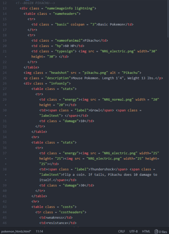
Results
Once the HTML and CSS were written, it was just a matter of filling in the card information and images.
Here are the cards in the browser:
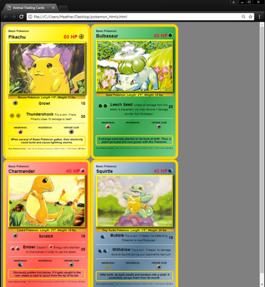
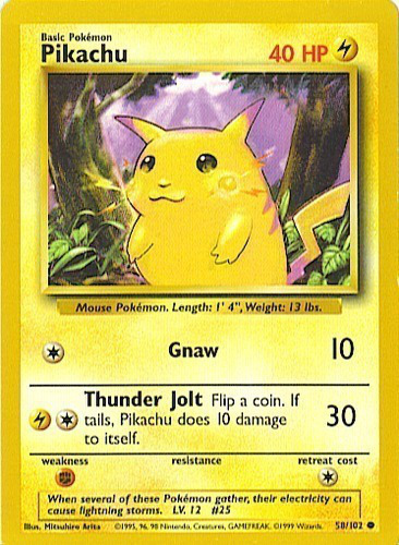
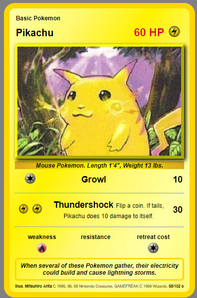
And here are photos of the real cards (left) versus the CSS cards (right).
I intentionally changed a few things around (names of attacks, HP, etc.) to show that I really wrote the HTML and CSS for them and didn’t just use an image editing program to modify the card photos. 🙂


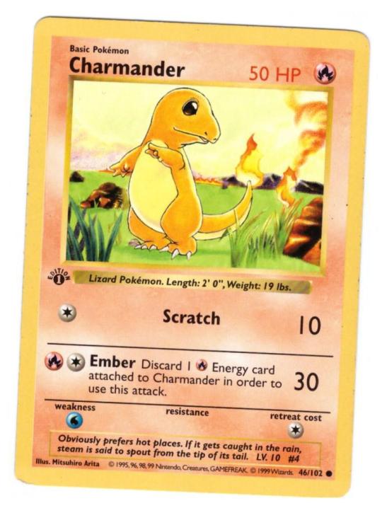
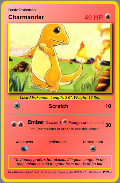

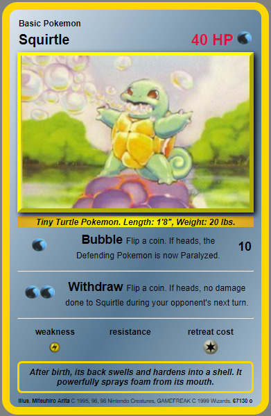
Takeaways
Once I had the HTML and the CSS written, it was very easy to make subsequent cards. I created a dual class for the background div that set the background gradient color as well as the gold border of the card. For different types of Pokemon, I created a different class for each gradient combination, and the HTML references the CSS class for the proper gradient, which saves a lot of coding time.
The card “guts” can just be copy and pasted into infinity. They reference the same CSS classes for every card (except for the background, as I just mentioned). If you’ve already made a bunch of cards and decide you want to change something about the style – no worries, just modify the CSS, and every card gets the new style with one edit.
The only things you need to update to make a new card are the images and text.
This project was extremely helpful in understanding the power of HTML and CSS working together. 🙂
CSS – Fake Pokemon Cards I'm currently working on a Udacity Front-End Web Developer course, thanks to a Grow with Google Challenge Scholarship…
0 notes
Text
New Post has been published on Weblistposting
New Post has been published on https://weblistposting.com/app-radar-cool-new-apps-for-android-and-ios/
App Radar: Cool new apps for Android and iOS
The modern releases of apps and video games for Google’s Android and Apple’s iOS launched this month include a movement sport based totally on famous Television series Energy Rangers that has also been made right into a movie now. The launch of the sport coincides with the release of the movie. also, the contemporary day variation of the mythical Pc recreation Mario is finally to be had at the Google Play Keep. Amongst apps, there is new VPN app for mobiles and a completely unique chat-primarily based language learning app.
Nintendo’s new strolling recreation Top notch Mario Run is an extra developed model of the DOS-based totally Mario game from the Nineties. It follows the equal facet dealing with a view and has a comparable fashion of gameplay—the lead person movements on its personal at the same time as users get to control his jumps and slides via tapping, double taping or swiping on the touchscreen. The fact that you may play it inside the portrait mode manner you can play it with one hand. It is an offline game and works on the maximum primary Android telephones.
The cloak is a paid VPN service that provides an additional layer of protection in your online connections. It additionally allows customers to get right of entry to on-line content limited to pick countries by channeling facts through servers positioned in those international locations. This means you will watch a movie on Hulu in India or download a game this is most effective available on the Play Shop in Australia. The cloak is unfastened to use for 14 days, the past which users will pay $9.99 in step with the month.
This is a film aggregator web site on similar strains as the IMDB. possible appearance up old, new and upcoming films on the app with the aid of browsing via a couple of genres or the list of popular and trending films. In case you need to peer the scores or examine up critiques, the app offers hyperlinks to famous rating web sites together with Rotten Tomatoes, Metacritic and IMDb. It also suggests the listing of all streaming web sites that have the license to movement the movie along side the price involved.
The listing of High-quality Camera Apps for Android to Enhance Images
Currently, there are lots of Android gadgets which have been loaded with the superior Digital camera capability. A few of them are already loaded with the high-decision 12 MP Digital camera, much like the upcoming HTC Power in addition to Sony Ericsson Xperia Duo. However, nonetheless there are many clients who normally do not experience absolutely desired with the photo or photograph results. Therefore, they may do a look for the hundred% free and Excellent Digicam apps for Android as a way to trade or improve their photographs or photographs. The following are the examples of the Exceptional Digicam apps for Android smartphones or Computer capsules.
Adobe Photoshop Explicit
This will be likely the most and the Best Digicam apps for Android as it has lengthy been typically utilized by either laptop computer or Android handset users for photo/image enhancing. Happily, It’s far absolutely a hundred % unfastened and this may offer a few top functionalities for the wishes of photo cropping and enhance. The capabilities variety from the quick picture adjusting via utilizing crop, straighten, rotate, turn, and regulate coloration function. You could also share the photos to the web groups and backup them to Photoshop.Com effortlessly as properly. This fantastic app is obtainable to down load at Android Market.
Pro Paint Digital camera
The Seasoned Paint Digicam application gives a higher photograph result as it functions white balances, 4 filters, 35 cliparts, textual content fonts, photo consequences, the front-dealing with Digital camera help, instamatic brightness and comparison, silent mode, recognition control, together with macro, sharing, draw, paint, ISO manage (if supported), EXIF, adding your pix from the gallery, scene modes, and macro car-cognizance. Whilst you’re curious approximately this system, simply go to the Android Market and search for it.
Digicam Zoom FX
That is one of the one hundred% loose and First-rate Camera apps for Android handsets with the intention to supply the exquisite quantity of marvelous outcomes like reflect, artwork, distort, as well as body outcomes. It also offers superb editing tools, as an instance composite yourself at the side of a movie star, shutter skins choice, buddy, borders, amusing Props, set filters, anti-banding, white balance, night time shot mode, toggle autofocus, timer mode (with voice activation), strong shot in conjunction with burst mode.
photograph Album Organizer
Besides, the clients will want to edit or Beautify their photos, they may likewise need the Fine Digicam apps for Android which has the capability to set up the photo albums. The image Album organizer is the wise choice thinking about that it offers the fast albums making to obtain a far better picture viewing the usage of your mobile telephone. Similarly, it possesses the capability to type and relocate images and cover the albums as nicely to your privateness remember. Quality Android Apps – five Beneficial Apps for Android-primarily based Smartphones
As a Running Gadget for smartphones, Android is a difficult competitor for Blackberry and i-telephone based totally cellular devices. This Google-owned cell platform is utilized by famed phone producers such Samsung, Dell, Sony Ericsson, and Motorola for his or her smartphones. The Android had 25% proportion folks cellphone Market in mid-2010. The proportion will increase due to the fact that then and It is reported in May additionally 2010 that approximately four hundred,000 new Android-based smartphones are activated each day.
To support the ever-developing Android Market, Google and other mobile software program manufacturers have evolved an extensive collection of paid and loose Android apps. To put in these apps, you can at once download them via your smartphone. Once the download finishes, the apps can be automatically set up for your smartphone. As a substitute, if you want to limit records charges, you can download them out of your Pc or laptop and later set up them for your Android cell phone with the assist of software program like Astro download Manager. Under are some of the Great android apps you may get to your smartphones:
1. Google Doctors
That is one in every of numerous fantastic apps for Android cellular telephones as it allows you to control and Save your documents effortlessly. Google Docs allows you to synchronize your phone with files you have got for your Google account. Therefore you can freely get right of entry to and edit your files from your phone.
2. EzPDF Reader
Despite the fact that this isn’t the reliable PDF Reader (the professional one might be from Adobe), this app is really worth downloading and the usage of. even as the function from this app is largely the same as the Adobe PDF Reader app, ezPDF Reader is probably higher for amateur consumer considering that It’s miles extra person-friendly.
3. Astro Document Supervisor
Besides assisting you To install apps without problems to your Android phones, Astro Report Supervisor has greater Beneficial capabilities. This File Supervisor also functions as undertaking Supervisor and File customizer. The Astro Record Manager can also extract or create Zip and Rar documents and fix them on your e-mails. in case you are terrified of losing the valuable statistics to your tool, you may use this application as Report backup author which backs up the apps and facts out of your phone to its memory card. With the Astro File Supervisor, you may also test the performance of your Android OS.
four. Gmote 2.zero
This is by a long way the coolest Android application. The Gmote 2.zero comes without the bugs from the 1.zero version. With this software, you could trade your telephone into a far-flung manage and use it on your PC. Gmote 2.zero enables you to govern your PC when playing medias such as music and films. Except functioning as a far-flung control, this app can also help you in presenting PowerPoint presentations and slide indicates. Any other plus facet of this advanced version of Gmote is that this app can flip your phone into a WiFi touchpad.
five. Google Voice
This app is ideal for enterprise functions. Google Voice will notify you when a message seems. It also transcripts messages from the voicemails you’ve got acquired. This Android app is rather advocated for busy marketers and business human beings.
0 notes
Photo

New Post has been published on https://www.ltfblog.com/xiaomi-redmi-4a-review/
Xiaomi Redmi 4A Review
The Redmi series has anchored Xiaomi inside the sub-Rs. 10,000 segment in India. The agency launched its first Redmi cellphone, the Redmi 1S, in India in August 2014, and it turned into acquired nicely here. At a current occasion, Xiaomi confused how the Redmi 1S “become a phone manner ahead of its time” and claimed that the brand new Redmi 4A is precisely the identical.
That might be actual, due to the fact other telephones within the series which include the Redmi 2 (and Redmi 2 Prime) in 2015, and Redmi 3S (and Redmi 3S Top) in 2016 have impressed us consistently. These fashions have also been ordinary furnishings in our lists of the satisfactory smartphones below Rs. 10,000.
Xiaomi has already had one massive fulfillment in 2017, selling over a million gadgets of the Redmi Notice four within a record 45 days of its release. The Chinese language agency hopes to preserve that momentum going with the Redmi 4A, which brings capabilities which include VoLTE and a thirteen-megapixel rear digicam to the price range phase. Will the new Xiaomi Redmi 4A be as large a hit for the organization? We attempt to find out in our evaluate. Xiaomi Redmi 4A layout One of the first stuff you word whilst you maintain the Xiaomi Redmi 4A in your hands is that notwithstanding looking lots like metal, the body is clear polycarbonate. The rear panel has separate segments on the pinnacle and backside that mimic the antenna bands visible on steel-bodied Redmi fashions.
the new smartphone carefully follows the layout language of preceding Redmi telephones, and consumers on this fee segment won’t be dissatisfied. With a surprisingly small 5-inch display screen, the Redmi 4A is compact and consequently clean to apply with simply one hand. The volume rocker and power button are easily handy in the proper aspect, whilst the hybrid SIM slot is on the left. The charging port is on the lowest, and there’s a three.5mm audio jack and infrared emitter on the top. From the rear, this phone looks strikingly similar to the Redmi 3S. The Mi branding and the speaker grille on the back, are identical to those at the Redmi 3S. There may be no fingerprint reader at the Redmi 4A, which isn’t a surprise thinking about its fee tag.
The smartphone has slightly curved edges, even though we’d decide on the general shape of the Redmi 3S, that is more rounded and fits better in a palm, in our enjoy. on the Redmi 4A, the sides meet the rims with best a slight curve. However, the rear panel of this smartphone has a matte finish and offers a slightly higher grip.
At more or less 132 grams, the Redmi 4A is lighter than the Redmi 3S which weighs 144 grams. Xiaomi announced the India release that the Redmi 4A is the “lightest Redmi ever.” Notably, each fashion is eight.5mm thick. The Redmi 4A has been launched in 3 shades – Dark Grey, Gold, and Rose Gold. We received a Dark Grey unit for evaluation. The Xiaomi Redmi 4A comes with a charger, Micro-USB cable, warranty card, consumer guide, and SIM eject tool. As with other Xiaomi products, the Redmi 4A’s retail field does not encompass a headset, which is probably disappointing for some users. The retail field flaunts a “Made in India” tag. At its launch event, Xiaomi said that ninety-five percentage of its telephones are actually synthetic in India.
Xiaomi Redmi 4A specifications and software program The Redmi 4A functions a 5-inch HD (720×1280-pixel) display and boasts of a 296ppi pixel density. The enterprise claims that the display screen can reproduce 72 percent of the NTSC shade gamut. The show is shiny, and color reproduction is good enough. We had no problems using the cellphone underneath direct sunlight. Textual content and pics appear sharp while motioning pictures appearance good. The Redmi 4A offers a Reading mode which makes colorings less complicated at the eyes, and also permits coloration temperature adjustment via the Settings app.
The smartphone is powered by a quad-middle Snapdragon 425 processor clocked at 1.4GHz, with incorporated Adreno 308 graphics. It has 2GB of RAM and 16GB of storage which can be increased the usage of a microSD card (up to 128GB). The handset packs a non-detachable 3120mAh battery, which the enterprise claims can supply seven days of standby time. Other than 4G with VoLTE, the Redmi 4A helps Bluetooth 4.1, c084d04ddacadd4b971ae3d98fecfb2a 801.11 b/g/n, GPS/AGPS, and GLONASS. The hybrid dual-SIM slot can preserve one Micro-SIM and both a Nano-SIM or a microSD card at one time. Whilst SIM playing cards are used, the primary one could aid 4G calls and facts at the same time as the secondary SIM falls returned to 2G calls handiest. The sensors on board include a gyroscope, accelerometer, proximity sensor, and ambient mild sensor.
The Redmi 4A runs on MIUI 8 based on Android 6.zero Marshmallow. The business enterprise on the launch careworn that there are a variety of functions designed for Indian users. MIUI now helps 13 Indic languages together with Hindi, Kannada, Tamil, Marathi, Assamese, and Bengali.
on the software program front, lots of functions that have been visible on previous Redmi phones have made it to the Redmi 4A, including the twin Apps feature which permits users to create and check in to two separate times of any app (like WhatsApp, Fb, and more) on the same tool, and 2d Space, which lets in users to separate their enterprise and personal statistics at the same phone. The second Space characteristic also allows users to be signed into two separate Google debts.
The Redmi 4A permits customers to take scrolling screenshots, so, for instance, you may keep an entire Web web page which does not match on one display screen. A number of the opposite MIUI capabilities include a Toddler Mode that helps you to lock apps; the soaring Short Ball button which provides Quick shortcuts; and One-Handed Mode to reduce the show to at least one corner of the screen.
The dialler app in the MIUI 8 also has been improved and shows caller Identification by default. We want to additionally deliver a unique mention to the Mi Mover app that lets you move statistics from any other Mi smartphone. there may be a Issues app which lets you pick out from a sizable collection of wallpapers, ringtones, and fonts, A number of which fee money. But, we do desire that Xiaomi should reduce the amount of bloatware on the Redmi 4A since it has simplest 16GB of storage. There are masses of ‘redundant’ apps which include Scanner, Mi Community, and Mi Alternatives. The Redmi 4A additionally ships with Fb, Amazon Kindle, WPS Office, Makemytrip, and Flipkart preinstalled.
At its India launch occasion, Xiaomi additionally previewed a redesigned messaging app on the way to trade how IRCTC train tickets are formatted on screen. while you receive a confirmation message from IRCTC, Xiaomi’s MIUI 8 will realize it and reformat it to appear to be a real ticket, so that you can be visually refreshing.
Xiaomi Redmi 4A digicam performance The Redmi 4A has a thirteen-megapixel rear digicam with a 5-detail lens and f/2.2 aperture. It also has a LED flash and helps low-mild enhancement, HDR, panorama, burst mode, and face recognition. You furthermore might get plenty of real-time filters which may be used for fun. There is a 5-megapixel the front going through the digital camera with a f/2.2 aperture as properly. You get 1080p and 720p video recording alternatives at 30fps.
The phone’s foremost digicam manages to take pretty exact shots with first rate colors as long as There’s enough light around. pictures taken throughout the day have better details. We had been capable of awareness on items quickly sufficient but observed that the camera at instances struggled with close-up photographs. A number of our close-up photographs interested in the Redmi 4A ended up with lots of noise.
The rear digital camera at the Xiaomi Redmi 4A did not fare too properly underneath synthetic lighting fixtures, and shots ended up with a few amount of noise. Low-mild photographs tended to have a respectable amount of element, even though they were quite grainy. The front digital camera is able to take sharp and particular selfies that can be used on social platforms, even though it would not do well in low mild. The cellphone can record 1080p films, and the best is good. The digicam app is simple to apply, and we favored the truth that gets admission to modes and other matters take simply one faucet.
Xiaomi Redmi 4A performance We were fairly inspired with the overall performance of the Redmi 4A. There has been no lag While multitasking, and it easily treated switching between multiple apps. We enjoyed streaming movies and movies at the Redmi 4A, but need to admit that the 5-inch display feels a piece too small on the grounds that we are so used to larger telephones now.
Gaming at the Redmi 4A become additionally a laugh, and we had a good time playing Asphalt eight and Useless Impact 2. Those games, first of all, froze Whilst we tried launching them due to the fact a couple of different apps have been already walking in the background. at some stage in our evaluate, we noticed that There has been more or less 900MB of free memory at any given time, and we did sense that greater RAM could have helped. The Redmi 4A packs 16GB onboard storage out of which users get roughly 10GB of usable Area, and because of this, we needed to depend upon expandable garage. The Infrared emitter at the Redmi 4A helps you to control numerous appliances at home and works properly with a variety of set-top boxes and TVs.
The loudspeaker on the handset is loud sufficient to fill a small room, and you need to no longer expect it to outperform phones priced twice as high as this one. Earphones are not bundled with the unit, so we checked audio high-quality thru our personal stressed earphones, and it changed into the first rate. Xiaomi offers various audio tweaking options inside the Settings app.
The cellphone supports video codecs like HEVC and MPEG4 amongst others plus popular audio formats together with PCM, AAC/eAAC+, MP3, FLAC, and WAV.
One of the highlights of the Xiaomi Redmi 4A is that it supports VoLTE (voice over LTE), and the handset turned into able to latch on to networks even in areas with susceptible signals. Name first-rate changed into decent, and we should have long conversations comfortably due to how small and light this smartphone is. We failed to sense any overheating all through our assessment.
The Redmi 4A got respectable ratings in our benchmark checks. It controlled 27,567 in AnTuTu, sixteen,693 universal in Quadrant, 3,684 in 3DMark Ice Typhoon Intense, and 13fps in GFXBench’s T-Rex check.
The non-removable 3120mAh battery gave us an outstanding 12 hours and 35 minutes in our HD video loop check. With heavy real-global usage, the Redmi 4A was a powerhouse and easily lasted for over an afternoon. It is really worth noting that this was without the use of the electricity saver mode.
We did try this mode at the Redmi 4A When the battery become all the way down to simply 20 percentage, and it gave us eight hours of light utilization past that. you could pick out apps to exempt from restrictions due to the battery saver. We located that the phone took less than two hours to charge absolutely. Fast charging is not supported but this shouldn’t be a dealbreaker for purchasers searching out a phone at this rate.
Verdict the new Redmi 4A absolutely raises the bar for smartphones at this charge degree, and we count on it to be very famous. At Rs. five,999, the Redmi 4A offers loads of features, particularly VoLTE support. camera performance is decent, and the polycarbonate body, 3120mAh battery, and software are all first-class.
It is going to be exciting to peer how well the Redmi 4A plays compared to the Redmi 3S which remains available at Rs. 6,999. For simply Rs. 1,000 extra, customers can get a metal body, better Snapdragon 430 processor, and more battery strength in the event that they choose to shop for a Redmi 3S as an alternative.
The Redmi 4A seems to be centered at the beginning time smartphone consumers, and for that target market, it looks as if a first-rate alternative.
0 notes